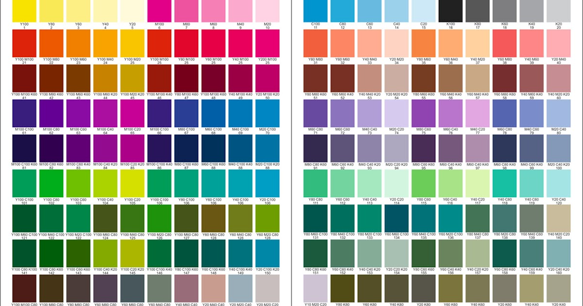
A beautiful piece of work, no matter how aesthetically pleasing, loses more than half of its value if not adorned with suitable colors. In printing, the criteria for color are even more critical. Therefore, the selection of printing colors always takes the most contemplative time in designs. The printing color palette is diverse and mystical. Let’s explore it through the following article.
Printing colors are combinations of ink that create impressive color tones in print designs, providing sophistication to each product according to the designer’s expectations. The success and cost-effectiveness of the printing process depend on the adjustment and coordination of the main printing colors. This technique relies heavily on the experience, skills, and aesthetic sense of the print designer in handling color palettes.
The printing color palette (also known as the color system in printing) sets standards for the main printing colors and the derived colors from those main colors. Print designers choose a color palette that suits their pattern, color, printing material requirements, etc. Once a specific color palette is chosen, adherence to the color coordination standards within that palette is essential to avoid time-consuming adjustments and ensure a polished print.
CMYK stands for C – Cyan (blue), M – Magenta (dark pink), Y – Yellow, and K – Key (representing the primary color of the palette, which is black). The characteristic of the CMYK color palette is that when all these colors are printed in the same position on the material, the resulting color is black. Thus, specialists need to be mindful of color arrangement in the design to avoid overlapping print errors that may affect the expected colors. The CMYK color palette also provides standards for coordinating main colors, creating authentic, sharp, high-contrast secondary colors like red, blue, and green, which absorb light well.
RGB stands for R – Red, G – Green, B – Blue. This color palette reflects light well, providing a sparkling and attractive appearance to printed products through printed lines and patterns. The color range created by these three primary colors is more diverse than the CMYK color palette, offering 4 primary colors. Due to these advantages, the RGB color palette is widely used in most color printing design needs.
To meet high aesthetic demands, the technique of combining multiple color palettes in a single design has been successfully researched and applied through editing. Therefore, CMYK and RGB color palettes can be overlaid or juxtaposed to create a multi-color effect, reflecting and absorbing light. However, due to their contrasting nature, there may be color variations, for example, the blue color in the CMYK palette will be more subdued than in RGB. Designers need to check and balance to achieve color uniformity consistently on the final product.
Among printing technologies, offset printing is currently the most favored due to its extremely high color accuracy and the ability to maintain durable colors, providing customers peace of mind during storage or use of printed products. To achieve these advantages, the offset printing color palette is researched and formulated in advance. Currently, the entire offset color palette has 250 colors, fully meeting all color pattern, pattern, and text ideas that customers set.
The 250-color palette is the result of combining two color palettes, CMYK and RGB. To get the original colors, use the main components of both color palettes, and for mixed colors, coordinate the main colors from one or both color palettes. For example:
From the CMYK color palette:
Cyan + Magenta = Blue
Magenta + Yellow = Red
Cyan + Yellow = Green
Cyan + Magenta + Yellow = Black
From the RGB color palette:
Red + Blue = Magenta
Red + Green = Yellow
Blue + Green = Cyan
Red + Blue + Green = White

In simple terms, the Golden Ratio is a mathematical ratio. It is abundantly present in nature, and when applied in design, it represents aesthetics, embodying the natural balance of creation. But have you ever wondered what the Golden Ratio truly is and how to use it to enhance your designs?

When it comes to print advertising, understanding the appropriate sizes is crucial for creating high-quality and engaging materials. This article will guide you through the considerations and benefits of adjusting print sizes to achieve satisfactory results.

In lighting design, a solid understanding of the applicable standards is the key to creating harmonious and efficient lighting spaces. With the continuous development of technology and modern design trends, mastering crucial design standards is not only necessary but also a determining factor for the impression of a space. Let’s explore and grasp these standards together to create innovative lighting spaces that touch every human emotion.

Everything in the office should be arranged, organized, and selected to achieve evenness and balance in a certain proportion. This principle is also applied to many small office design models.

In interior design, many consumers mistakenly perceive lighting design as simply selecting different types of lamps, determining wattage, choosing styles, and matching colors with the interior. However, in reality, this is an inaccurate concept.

In the field of fashion retail, a fashion store front typically has 3 mannequins, IKEA arranges items like a home, … It’s not by chance that products are placed the way you see them. Each position in the store is carefully calculated to keep customers there longer, which translates to spending more. The job demands both creativity and a business mindset, and it belongs to visual merchandisers. In this article, find out how visual merchandising works, its impact on brands and revenue.

Surely you have come into contact with printed publications such as desk calendars, flyers, standees, etc. So have you ever wondered how these publications are created or who is behind these publications?

Offset printing is a printing technique in which inked images are transferred (offset) onto rubber sheets (referred to as offset plates) before being pressed onto paper. Nowadays, offset printing technology is widely used by printing companies in Hanoi.

A beautiful piece of work, no matter how aesthetically pleasing, loses more than half of its value if not adorned with suitable colors. In printing, the criteria for color are even more critical. Therefore, the selection of printing colors always takes the most contemplative time in designs. The printing color palette is diverse and mystical. Let’s explore it through the following article.

Event organization is one of the popular and highly competitive industries in the job market that attracts the interest of many young individuals. It is also a crucial aspect of the advertising, communication, and entertainment services industry.

Before launching a new product, the first thing a business needs to do is market research to understand customer needs, current market trends, and competitors. This will help the business identify target markets and develop appropriate marketing strategies to promote its product.
